One of the great – but perhaps frustrating – aspects of astro imaging is the urge to return to objects you’ve already imaged to get something better. As our skills improve and our equipment collection grows it’s natural to find our skills grow and the quality of our results improves. I imagine most of us started down the astro-imaging rabitt hole with a DSLR. It’s a good place to start; it’s familiar and ubiquitous so there’s no shortage of detailed how-to information. But eventually we want more so we upgrade our equipment and learn new skills.

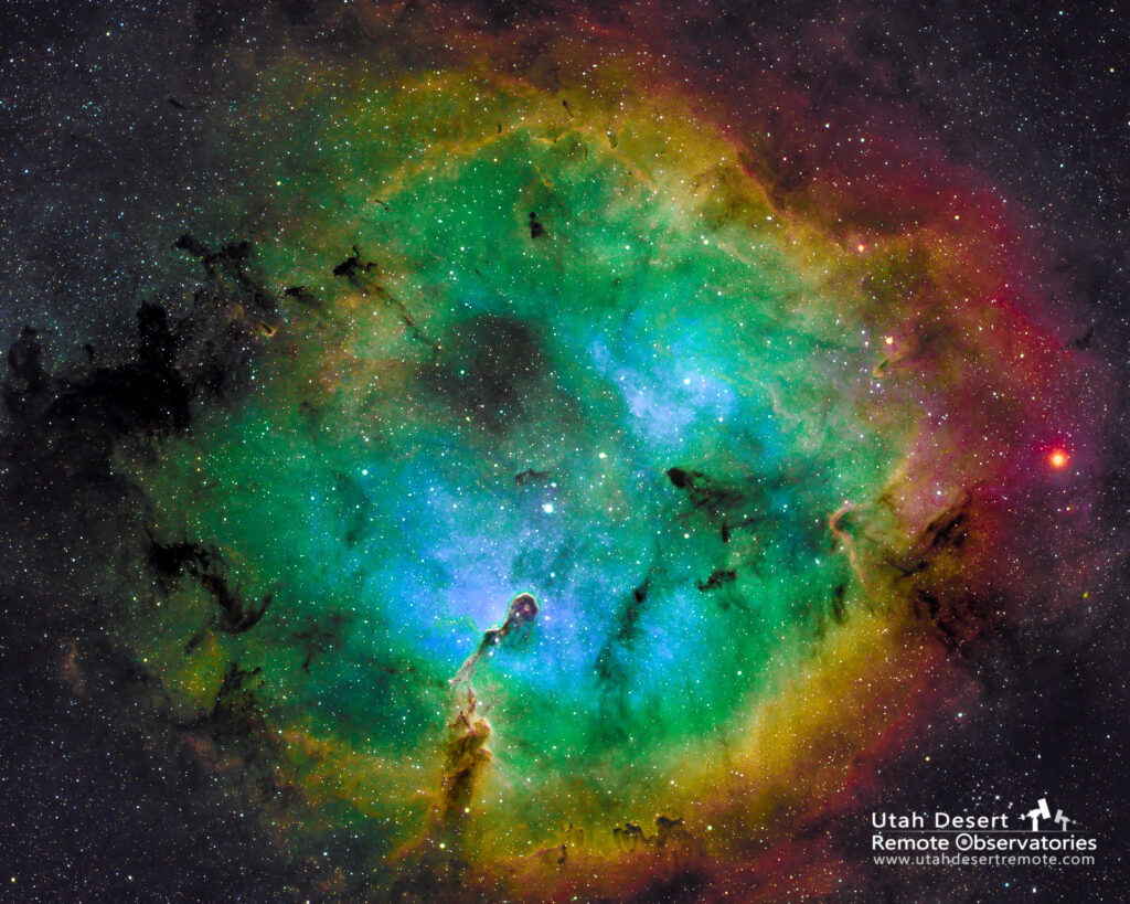
The difference between these two images of the Elephant Trunk Nebula is a good illustration. The were captured through the same telescope but one used a DSLR and the Optolong lEnhance filter while the later version was captured with a monochrome dedicated astronomy camera using discrete hydrogen, sulfur and oxygen filters. Both versions have full RGB color stars. Another big difference is the quality of the sky. The December 2020 version was from my Bortle 5+ backyard. I now have access to a much darker and clearer sky at Utah Desert Remote Observatories where the dark sky allows more of the subtle detail to be revealed in the image.
I resisted using the Hubble palette until recently since it’s color mapping produces an image that is far from natural color. Ionized hydrogen gives off a distinct dark red color in much the way a neon light glows. Sulfur also glows in a reddish color but at a slightly different wavelength. Ionized oxygen produces a blue color of light. There are two problems with that; in terms of color there isn’t a lot of separation between sulfur and hydrogen so it becomes hard to visualize how the two gases are distributed. Secondly we perceive red as a dark color to it doesn’t create much tonal contrast making it harder to distinguish the physical structure of the object.
The Hubble palette helps solve both of those problems. By mapping hydrogen to the green channel we are showing the most prominent gas in the brightest of the three photographic primary colors of red, green and blue. That creates a lot of color contrast between sulfur and hydrogen and also brings out more tonal contrast allowing us to really see the structure. It’s not natural color but it conveys a lot more information.
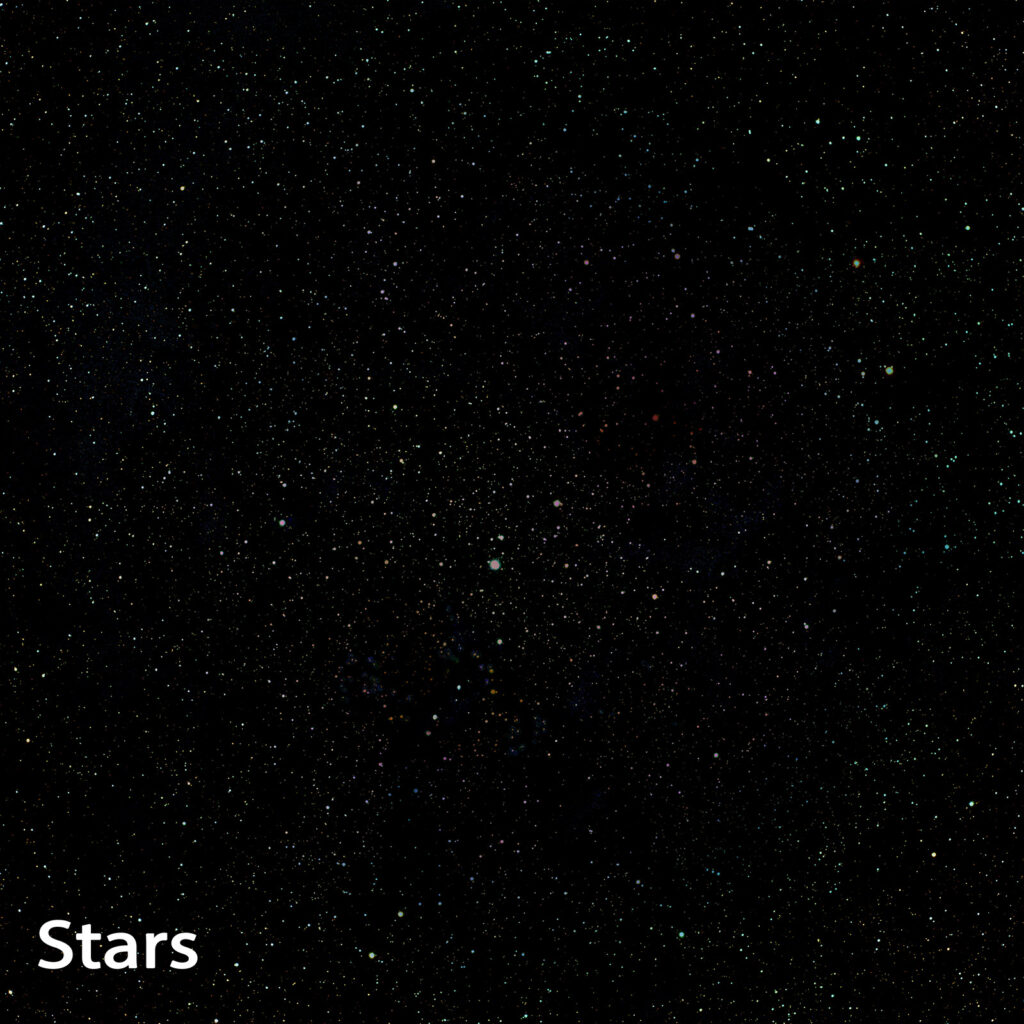
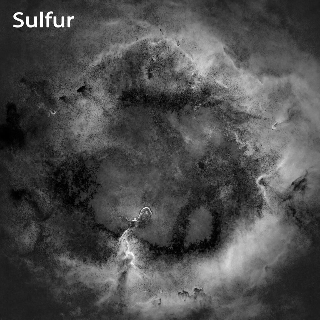
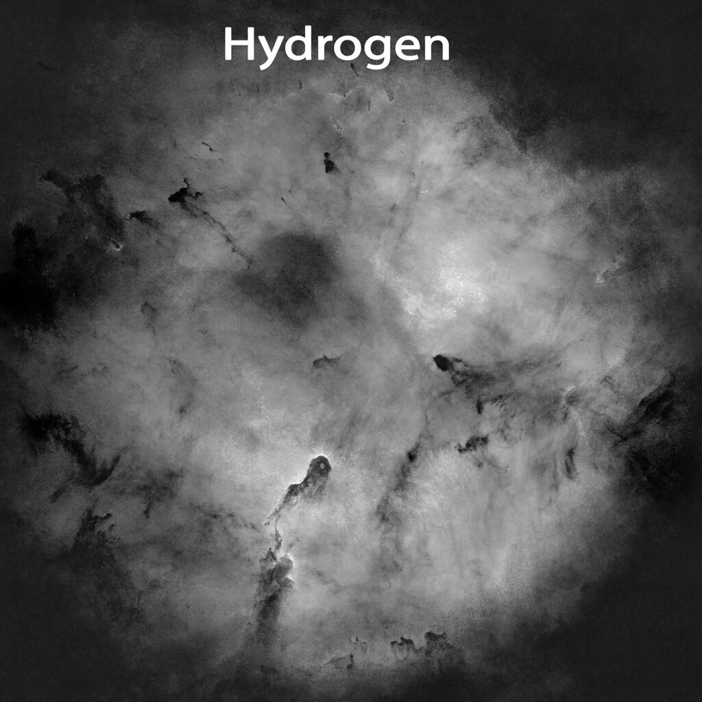
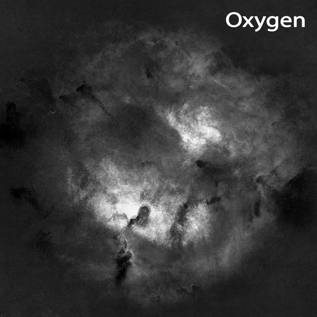
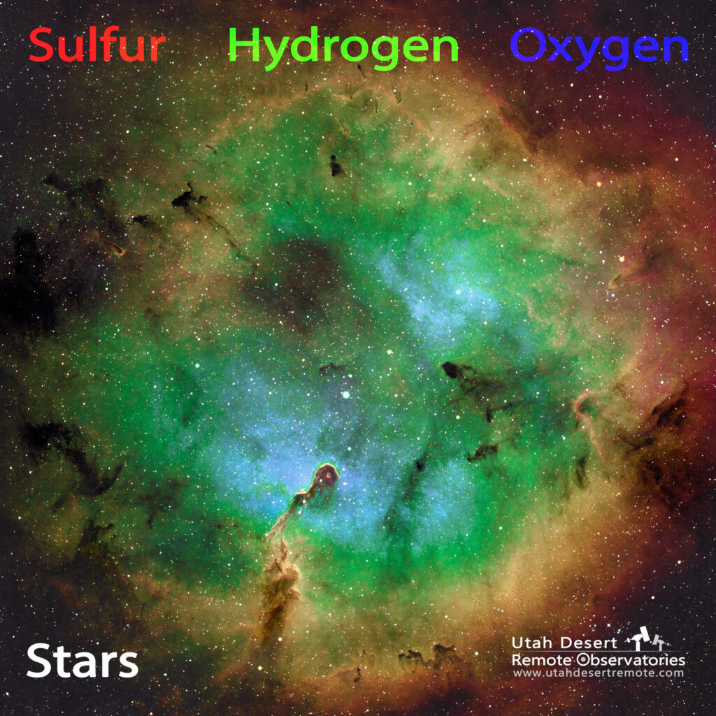
The Hubble palette shown in its individual parts. While there is a lot of processing involved to get to this simplified view it’s still a pretty accurate representation. Most of my images are made of layers where the base layers represent the individual gases with stars removed and the top layer adds the stars back to the image. Color mapping the layers containing the various elements creates the final colorful version.
I also recorded a short video showing my workflow in more detail as well as the specific method I use to color map narrowband images. My approach is different from most astrophotographers but I think it is faster, easier, more flexible and provides a non-destructive method so you can easily apply changes.