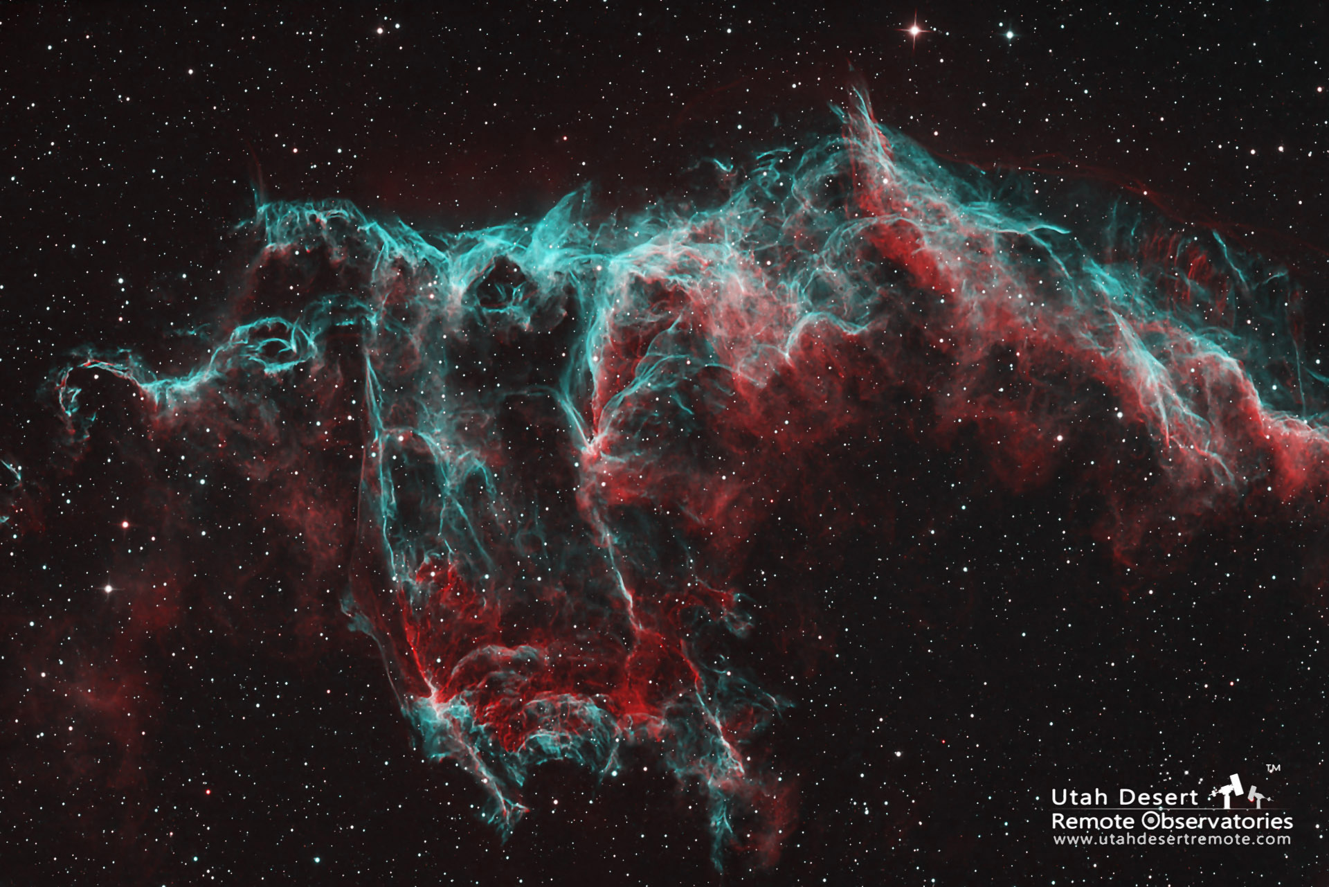
Would you like to try your hand at color-mapping an astro image? Here is the Eastern Veil Nebula processed as HOO where hydrogen is color mapped as red and oxygen is color mapped as green and blue – which makes cyan.
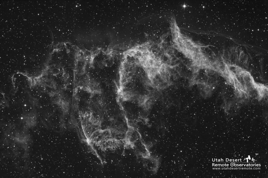
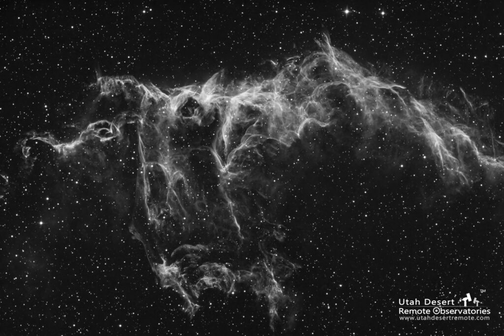
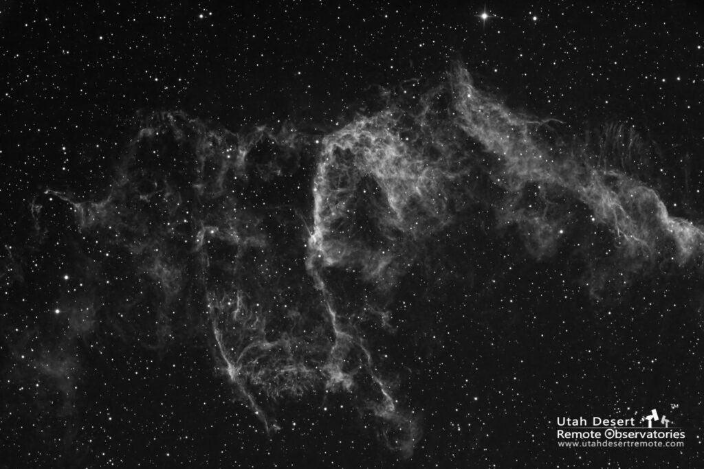
Below are the three source files. Notice first of all that they are black and white. That’s true of most astronomy images. We typically use a camera with a simple monochrome sensor which is more sensitive to light and yields a cleaner image. The exposures are taken through special glass filters. Color is created when they are combined and assigned to a color channel.
Color in a digital image is created by combining red, green and blue to create a wide array of different colors. When red, green and blue intensities are all equal you get white (or gray). A JPEG image file actually contains three copies of the image, one representing the red values, one the green and one for the blue. When you view the image the computer determines the color for each pixel location by using the corresponding red, green and blue values. Those three values are sent to the monitor where they are displayed in very small adjacent spots. Our eyes see them as one spot and our brains decode the combination of red, green and blue as a distinct color.
In astrophotography we sometimes use red, green and blue filters to create a natural color image. There are a couple drawbacks to that approach. The first is that light pollution washes out the scene so it’s much harder to capture the color and detail that’s really there. Another problem is that two of the three most dominant gases, hydrogen and sulfur, are very close to the same color of red. If you’re trying to understand what elements are where then it’s very difficult to do.
The solution is to capture the images using special narrowband filters where each filter will only pass the specific color of one element. The three most common are hydrogen, oxygen and sulfur. The result is a set of monochrome images that represent the object’s makeup of each of those elements.
In order to make sense of it (and to create something striking and beautiful) we typically combine the individual monochrome images in one image by assigning each element to one of the colors. The result is a color image where the colors represent the presence of a specific element – or a combination of elements.
As both scientists and photographic artists we have lots of options for how to choose the color for each element. Both hydrogen and sulfur are naturally red, oxygen is naturally cyan (a combination of green and blue). An obvious choice is to assign both hydrogen and sulfur to red, and cyan to green and blue. That yields a pretty natural result but conveys less information since we can’t see the difference between hydrogen and sulfur.
To get around that we frequently explore alternative mapping ideas. Many will tell you that the most legitimate is to maintain the color order. Since sulfur is the most red it is assigned to the red channel, and since oxygen is the most blue it goes in the blue channel. That leaves hydrogen in the green channel. That combination is usually called SHO or the Hubble palette.
I believe that any color mapping scheme that allows us to visually differentiate between the different elements – and looks good – is a valid approach. Sometimes HSO does a good job, sometimes OHS works well. It’s not unusual to find you need to experiment quite a bit to get the best result.
Of course one of the best ways to learn about something is to try it for yourself. Click on each of the monochrome images above and it will open as a high resolution image by itself that you can save to your own computer. Then use a program like Photoshop or PixInsight to experiment with color mapping choices. The video below shows step-by-step how to do it yourself.


