What’s in a color palette? The choice can make a big difference in the appearance of an image as well as the information it conveys.
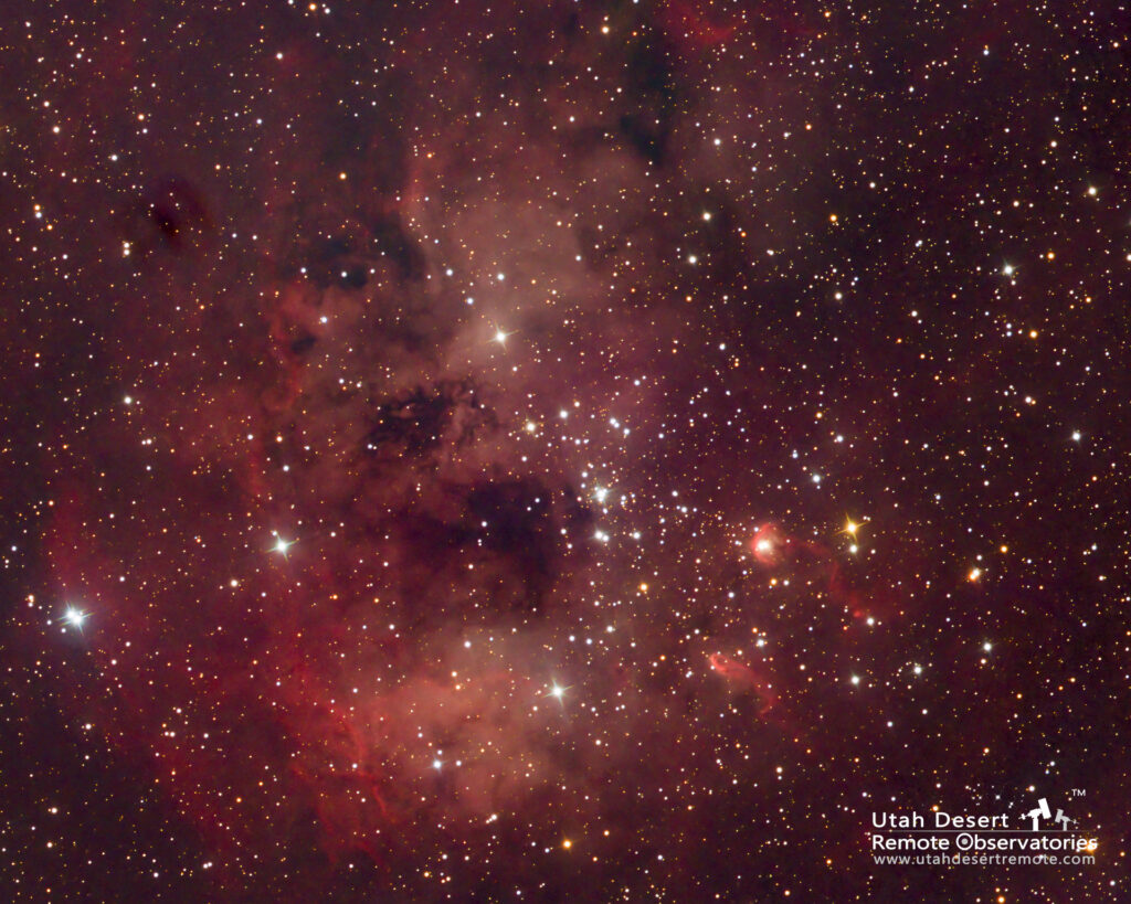
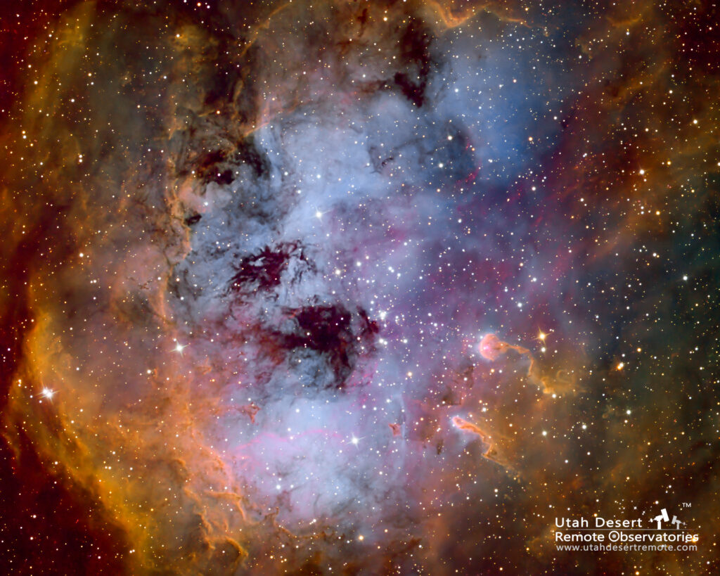
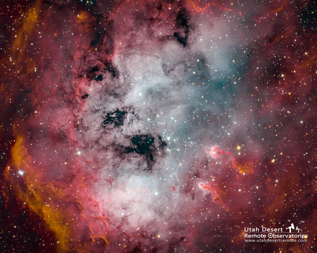
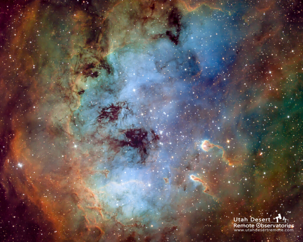
Consider the example shown here. The Tadpoles Nebula has a lot of the three common narrowband elements; hydrogen, oxygen and sulfur. Choosing how to color map the gases has an obvious affect on the appearance, but also on our visualization of the structure and composition of the nebula. The SHO color palette maps sulfur as red, hydrogen as green and oxygen as blue but there can be a lot of variation depending on how the three are blended. The ultimate goal is to create color contrast so that it’s easy to visualize the different elements that make up the nebula.
One of the features of the SHO color palette is that it retains the natural order of the gas’ colors from most red (sulfur) to least red (oxygen). Sulfur and hydrogen are both a deep red color and difficult to tell apart visually. That’s a big reason the RGB image is dominated by the red color with little detail visible. By translating the gases into colors that are more distinct we’re able to get more information from the image.