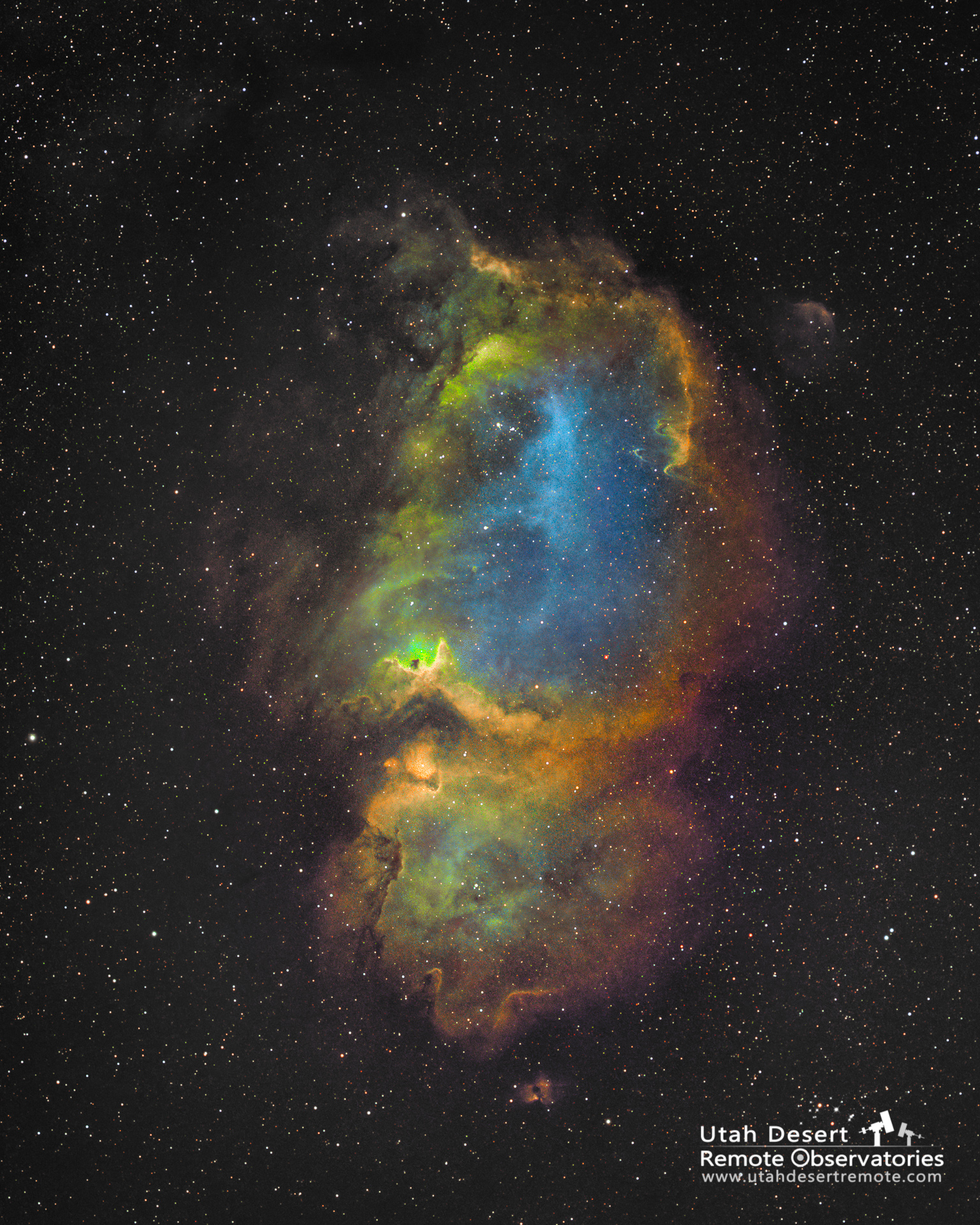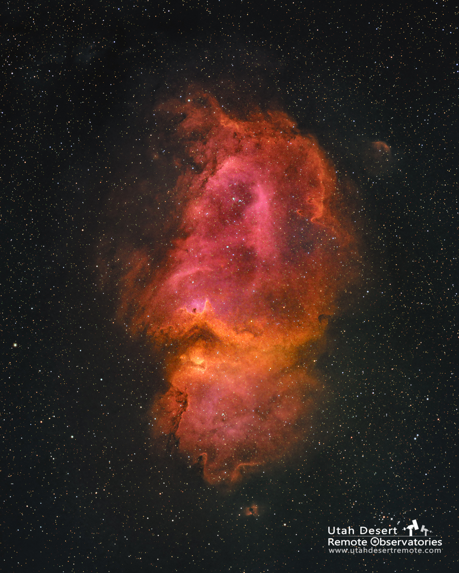
A tale of two palettes. Color in my astrophotos serves two purposes – to help identify where various elements are most common and to make the image appealing. Here is the same data shown in two common color mappings; HSO and SHO (also known as the Hubble palette). It’s amazing to me how much difference there is.
The HSO color palette tends to get somewhat muddy since both red and blue are perceived as dark colors. Since the hydrogen signal is the strongest it tends to dominate the color palette and you end up mostly with various shades of red. It does however provide a nearly true color image.
The Hubble palette of SHO on the other hand maps hydrogen to the green channel where it can really shine as a bright color. When sulfur is added to the red channel and oxygen to the blue channel you’re able to create a lot more color separation to more clearly highlight the presence of the various elements. In this example I feel the Hubble palette does a better job of both providing information and creating a striking image.