I probably like comparisons more than most other people. In fact I like comparisons the way most people like analogies.


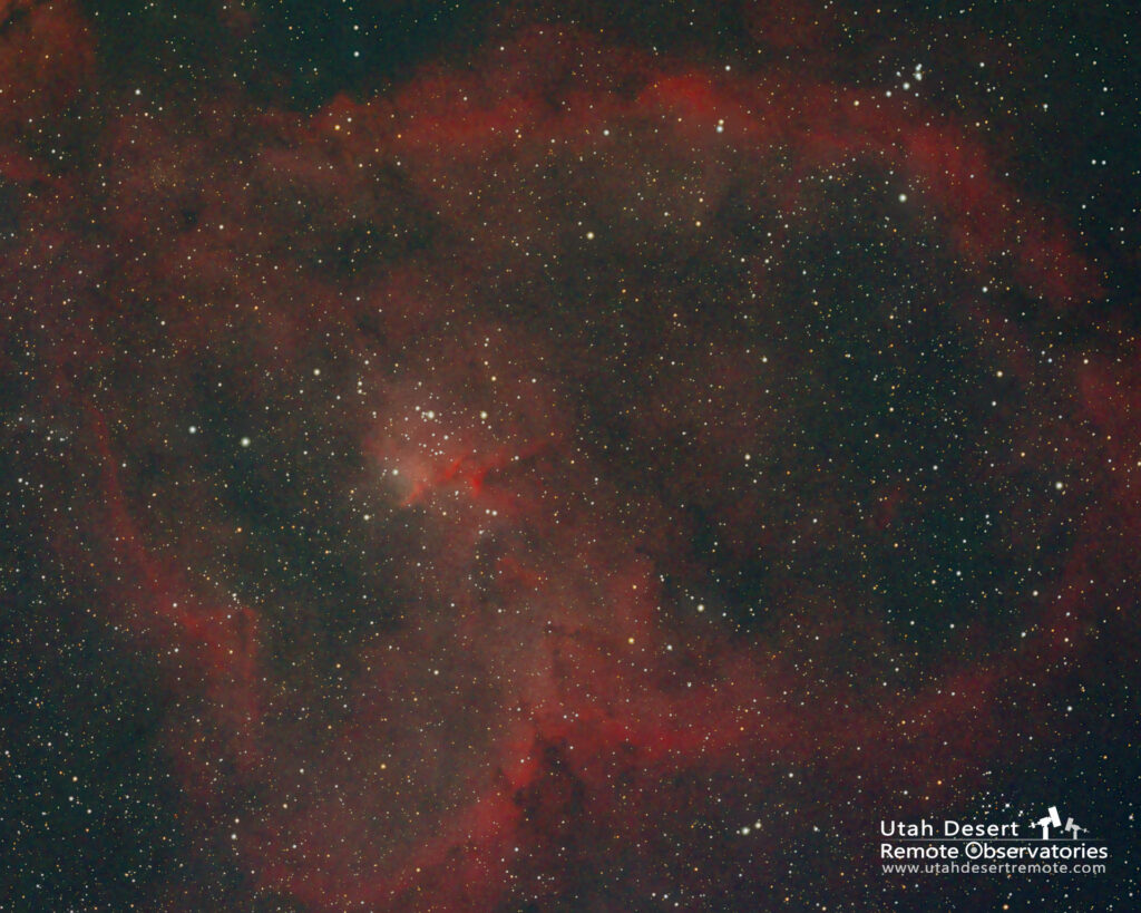
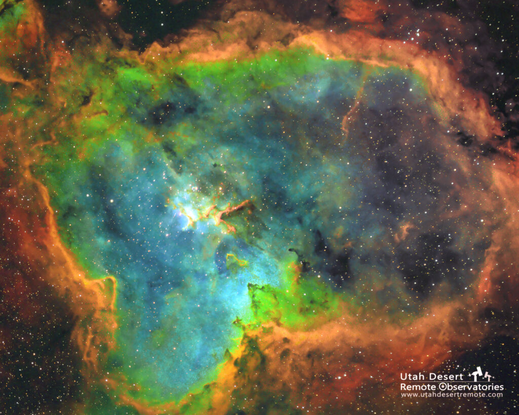
Anyway, here’s a comparison of the Heart Nebula in simple RGB natural color and a deeper version shot with narrowband filters and processed using the Hubble palette where sulfur, hydrogen and oxygen and color mapped to red, green and blue respectively. Where the Hubble palette really shines is that it allows us to visualize where the various gases are most prominent in the nebula.
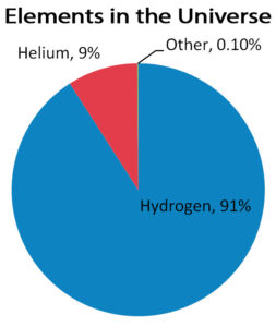
While it doesn’t show us what it looks like it does show us what it’s made of. It’s the same way a colorful pie chart might tell us about the makeup of the universe even though the universe doesn’t look like a pie chart (at least as far as we know).
